The Places You'll Go.
"I try to deal with the complexities of power and social life, but as far as the visual presentation goes I purposely avoid a high degree of difficulty."
-Barbra Krueger
-Barbra Krueger
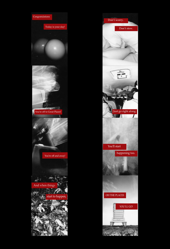
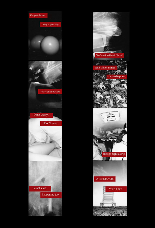
"Oh the Places You'll Go!"
Digital Collage
33.02 cm X 48.26 cm
September 2017
Digital Collage
33.02 cm X 48.26 cm
September 2017
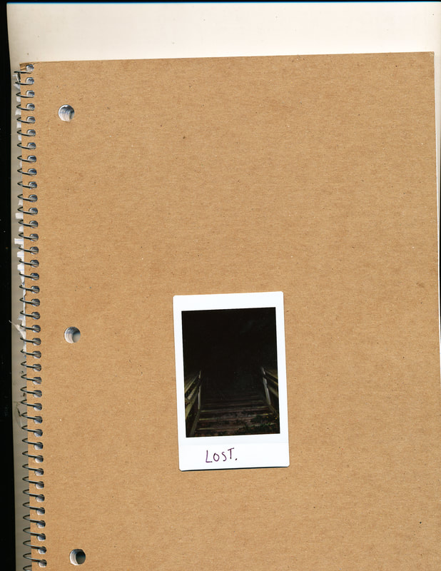
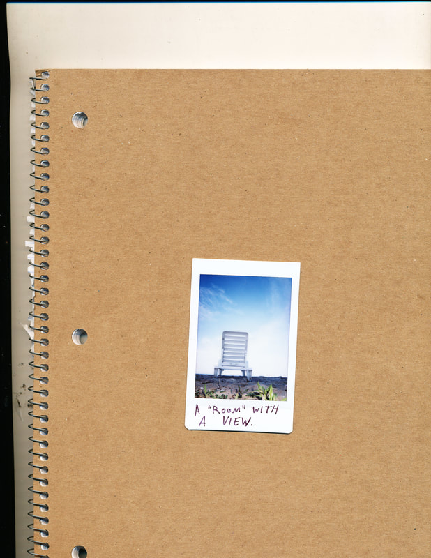
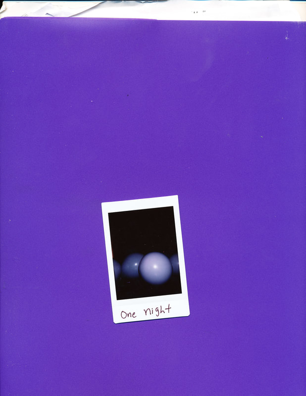
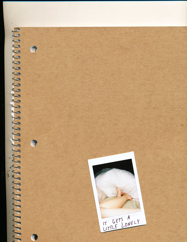
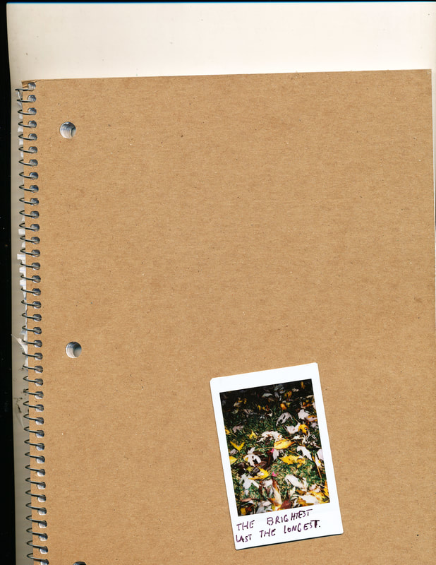
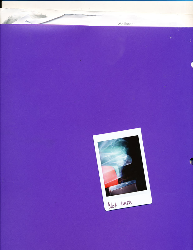
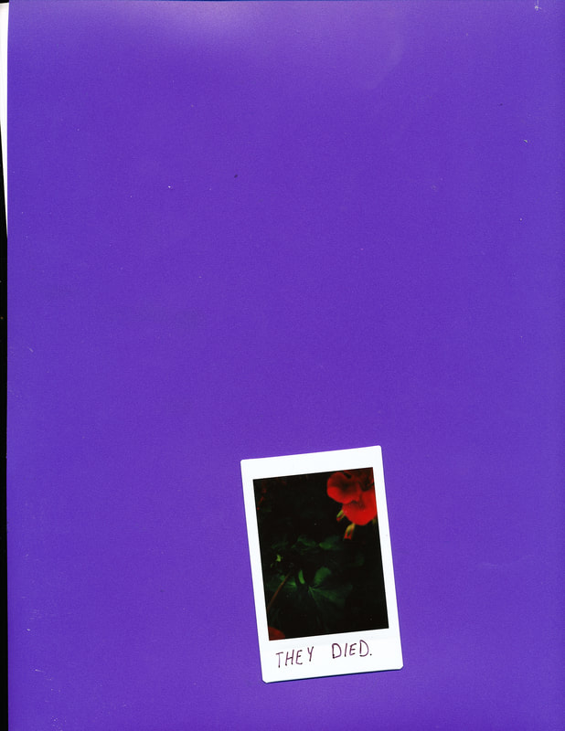
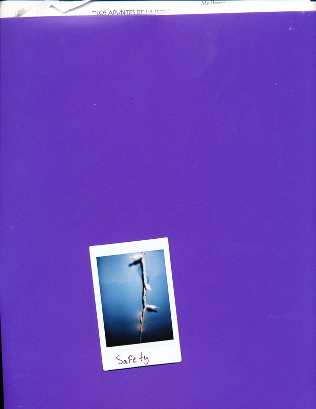
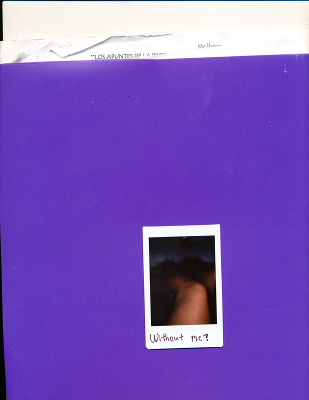
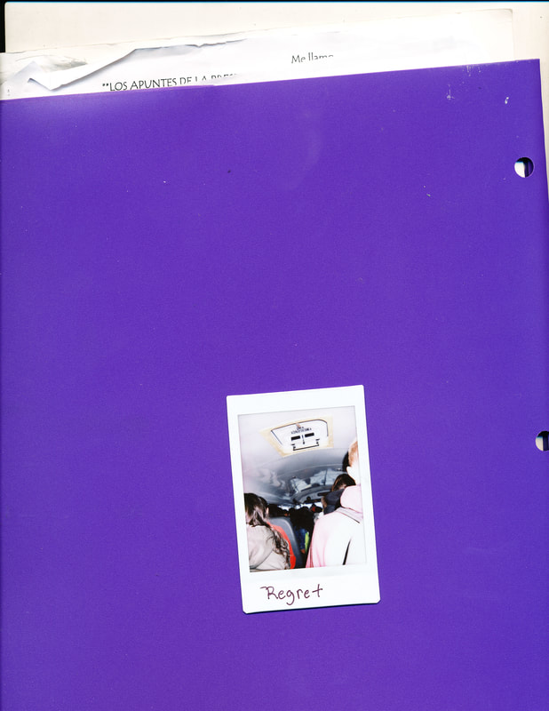
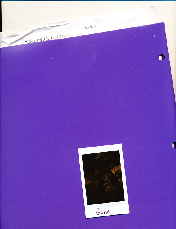
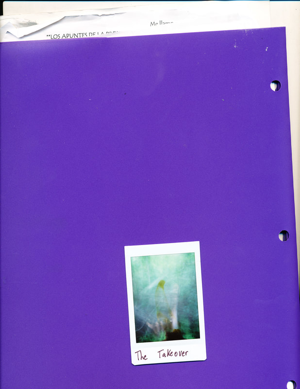
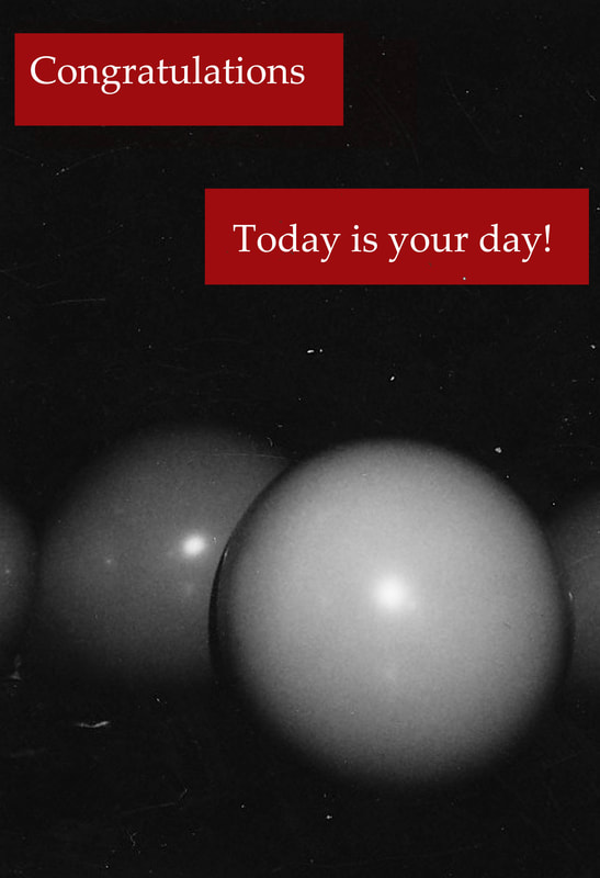
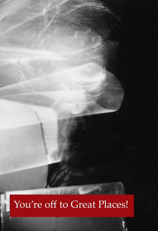
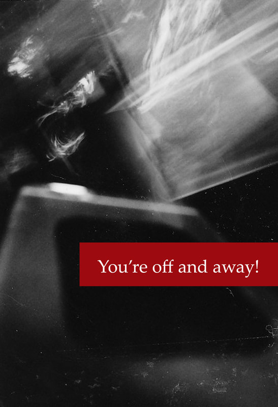
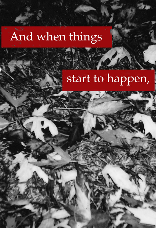
Using one of the works by Dr.Seuss. "Oh the Places You'll go!" as well as Barbara Kruger and Jen Gotch for inspiration, I created a piece centralized on the theme of time. As time is something precious for every person, each of the artists used bring their own ideas into my piece. Krugers format and contrast of ideas is present, as well as Gotch's use of Polariod photos. With Dr.Seuss' words and my abstract images, a series of 8 photos was created, showing how time doesn't stop for anyone, or anything.
Critical Investigation
Gotch, Jen. “Defaced 1.” Jen Gotch Photography, 2017, www.jengotch.com/defaced_main1.html. Accessed 1 Sept. 2017.
|
“Barbara Kruger.” 41 Artworks, Bio & Shows on Artsy, Artsy, 2017, www.artsy.net/artist/barbara-kruger.
|
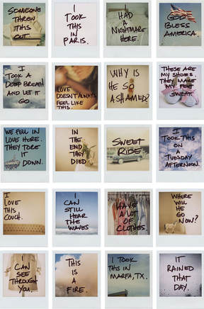
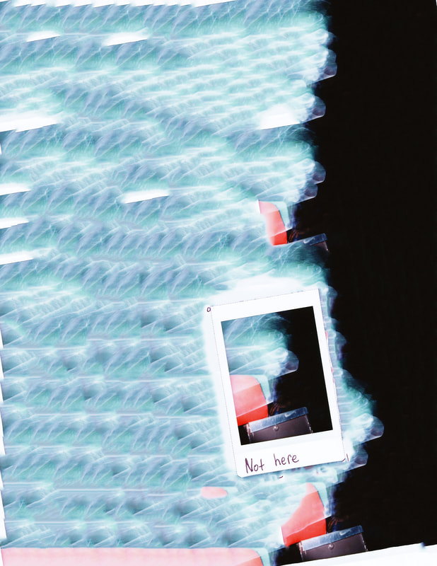
Jen Gotch is a photographer and blogger living in Los Angeles, California. During the start of her career as a photographer she was very into creating images that would contrast an initial belief. This is seen in her series "Defaced" through her act of ruining an image by writing on it. Every image she wrote over was a one of a kind Polaroid photo, so there was no going back. This is significant to her work because it takes away from a stereotypical beautiful picture, and adds a larger meaning. The marks made on every image add something, all though they all have seemingly simple commentary. Each image included in "Defaced 1" takes an image and puts it into context, from the photographers perspective.
The action of writing over the image gives a personal connection to the photographers life. This is different from simply just displaying a beautiful image. This can make the viewer see the photos from a new perspective, and tell a different story overall. This was an interesting way of displaying images. Just the Polaroid photograph alone can convey a more powerful meaning than a print. Working with Polaroids is largely based off of hoping that the image taken turns out how one wants it to. Once a cohesive and intriguing photograph is taken, it then is displayed. Gotch's decisions to directly transform the image is controversial. The appreciation for the photo quality is one aspect, and the writing over it is another. In "Defaced 2", Gotch simply crosses elected areas of her face, or her entire face out of the pictures. This alters how the image is taken in by the viewer. Once again her decision to alter the image impacts how it's perceived. "Defaced 2" suggests that Gotch doesn't to be seen, or she doesn't care about who is in the picture. This series is more about the simple existence of people, rather than just a single person.
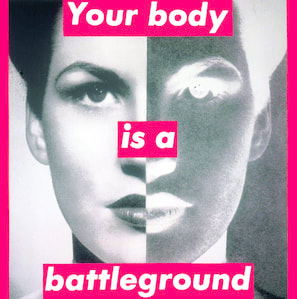
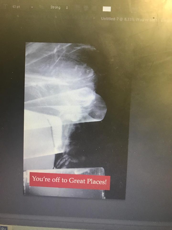
Barbara Kruger is a conceptual artist with works which often include incorporating old and modern ideas. She is commonly known fro creating works with a found photograph and placing text over them. Kruger gives short commentary on a photo, which critiques it. This makes the viewer question the meaning behind the piece and the artist intentions. Her commentary is usually meant to be controversial and discuss political and social issues, questioning the culture surrounding the image. Her works make the viewer debate what it is they want to see, versus what is actually in front of them. As Kruger's works use a strong contrast with a black and white photo (appropriated), within white text in a red box. The piece I chose to create takes away from Gotch's use of polariod photographs, and combines them with the formatting style of Kruger. While Kruger uses found photos and her own text. my work does the opposite. I used old Dr.Seuss poem, "Oh the Places You'll Go!" (found text) an original polariod photos. Combining these three artists I wanted to create a piece which would not be so much as political, but rather conceptual. I used a select eight of photos which could be contrasted with the words over them, but still make sense. The beauty of the photos feels emphasized through digital enlargement, combined with the concept of travel and achievement.
The action of writing over the image gives a personal connection to the photographers life. This is different from simply just displaying a beautiful image. This can make the viewer see the photos from a new perspective, and tell a different story overall. This was an interesting way of displaying images. Just the Polaroid photograph alone can convey a more powerful meaning than a print. Working with Polaroids is largely based off of hoping that the image taken turns out how one wants it to. Once a cohesive and intriguing photograph is taken, it then is displayed. Gotch's decisions to directly transform the image is controversial. The appreciation for the photo quality is one aspect, and the writing over it is another. In "Defaced 2", Gotch simply crosses elected areas of her face, or her entire face out of the pictures. This alters how the image is taken in by the viewer. Once again her decision to alter the image impacts how it's perceived. "Defaced 2" suggests that Gotch doesn't to be seen, or she doesn't care about who is in the picture. This series is more about the simple existence of people, rather than just a single person.
Barbara Kruger is a conceptual artist with works which often include incorporating old and modern ideas. She is commonly known fro creating works with a found photograph and placing text over them. Kruger gives short commentary on a photo, which critiques it. This makes the viewer question the meaning behind the piece and the artist intentions. Her commentary is usually meant to be controversial and discuss political and social issues, questioning the culture surrounding the image. Her works make the viewer debate what it is they want to see, versus what is actually in front of them. As Kruger's works use a strong contrast with a black and white photo (appropriated), within white text in a red box. The piece I chose to create takes away from Gotch's use of polariod photographs, and combines them with the formatting style of Kruger. While Kruger uses found photos and her own text. my work does the opposite. I used old Dr.Seuss poem, "Oh the Places You'll Go!" (found text) an original polariod photos. Combining these three artists I wanted to create a piece which would not be so much as political, but rather conceptual. I used a select eight of photos which could be contrasted with the words over them, but still make sense. The beauty of the photos feels emphasized through digital enlargement, combined with the concept of travel and achievement.
Sketching & Planning
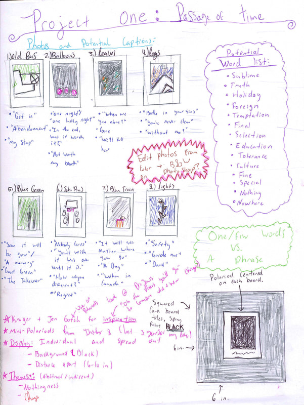
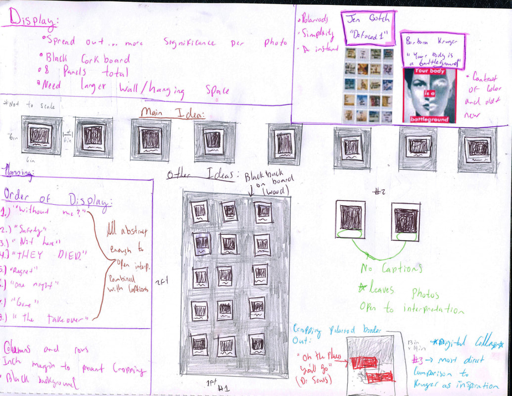
Through sketching and planning, the original idea compared to the final project is very different. The original idea was to display each polariod on it's own panel. I also considered grouping them together on their own board. With both of these ideas I wrote directly on the photo. I considered leaving them blank and open to interpretation, but this was not ultimately what I really want to do with the piece. I decided lastly that creating a digital collage would be the most visually appealing.
Experimentation
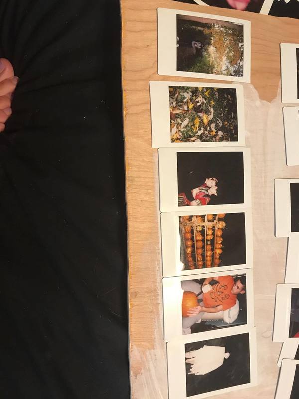
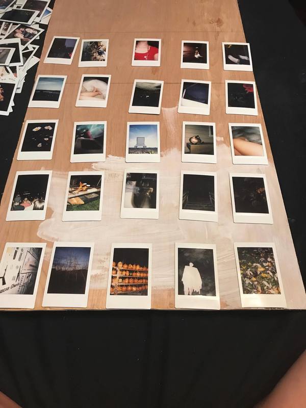
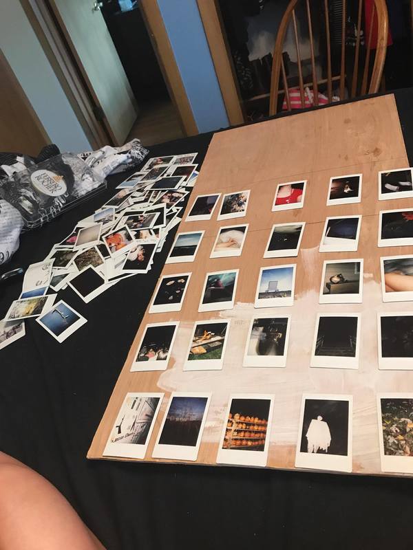
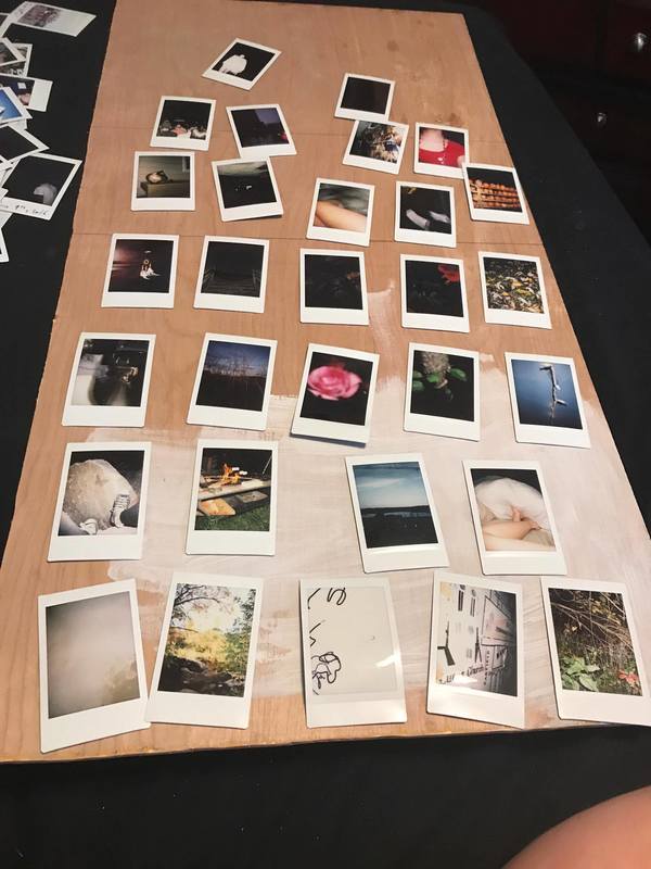
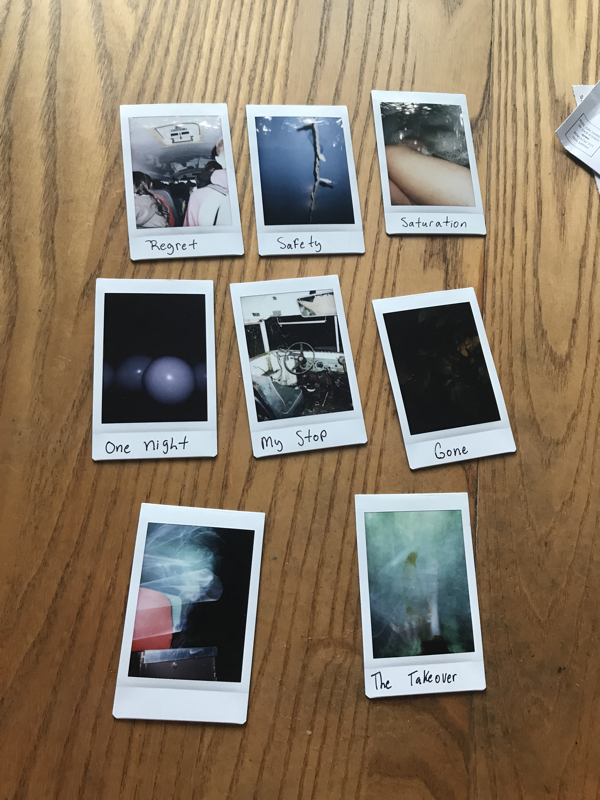
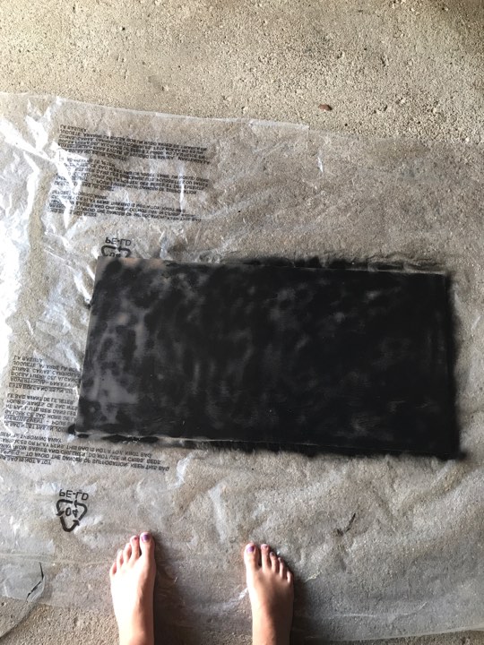
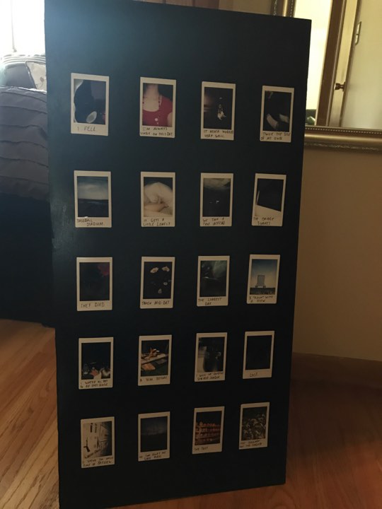
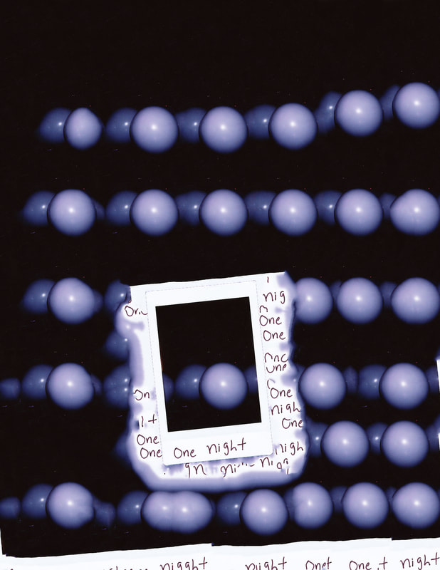
My original ideas were to use the same format as Jen Gotch, while writing on the bottom section of my polariod photos. I went through all of the photos I have taken since I got my polariod about three years ago. I had a piece of wood which I was planning on displaying all of the photos on. These would be in the same format of Gotch's "Defaced 1", with a five by four photo layout. I Also experimented with how I would display each image. Before deciding on using the red box and white text, I used the photoshop fill feature to alter the images.
Process
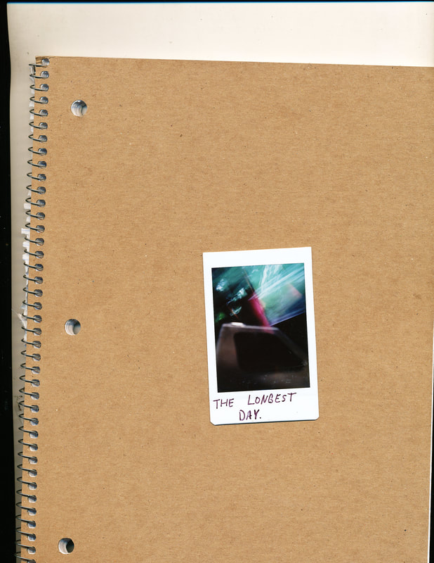
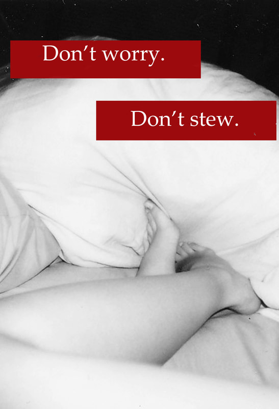
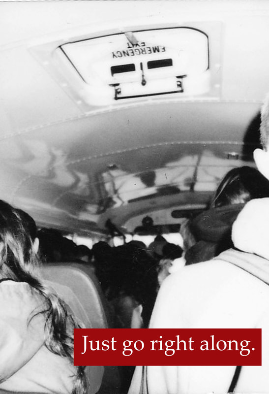
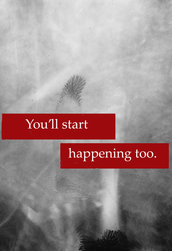
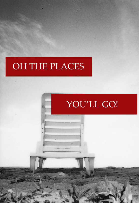
To create the final piece I scanned several final images I was debating on using. When scanning I placed the images on a background which would contrast, making it easier to use quick select on photoshop. Doing this makes the process of editing and creating the final piece much quicker and cleaner. I used quick select on each image, leaving out the border. I then selected the entire image and opened a new image canvas, making it 33.02 cm X 48.26 cm. From here I enlarged the image to make it fit the entire canvas. The images fit this rectangular canvas size well sure to the already rectangular polariod shape, resulting in being able to maintain majority of the full images. Each image was then given a new layer of the black and white filter. I decided not to do any other altering to the images. I just used the black and white filter so that Kruger's inspiration would be more direct with the viewer, and there would be a more sharp contrast. While adding a black and white filter make the image feel not only older, but more personal, it doesn't significantly change the polariod effect. Since I chose to crop the border out and keep the actual photo, there was a certain sentimental feeling lost. Polariods feel like a lost art with new age digital cameras. These photos are an instant of the past, and there is no going back once they have already been taken. Converting the color photos into black and white almost makes up for the polariod part being removed from the image completely.
The use of black and white in photos has been proven to give viewers a slower reaction time ot process how it makes them feel. Subtracting the color leaves things more open to interpretation. While green may make someone feel a more earthy tone, blue may make someone feel more upset towards the piece. Removing these colors and making the only one seen a primary red, makes the words emphasize their significance. It becomes less about the photos and more about the words. However the words were placed around the images so that the main features could be seen, giving a relevant background, much like Kruger. After making the photos black and white, I had to flatten all of the images. This allows for the final steps of editing and placing the words on to the piece. From here I was still debating whether I should use the captions written on the photos that I took, or if I should use the poem. And if I used my own captions if I should use my own image or edit it using Kruger's font choice/textual style. I decided on using the poem "Oh the Places You'll Go!" because I really wanted the aspect of something old in the piece. This gave the meaning and theme of the piece more distinct and centralized than it would have with the use of my captions. Using photoshop I self taught myself the best ways to use the fonts, create the red box, and maintain the concepts which I wanted to convey.
Lastly the format and arrangement was what I had to decide on what I wanted to do. My original idea was to just leave the images on their own 33.02 cm X 48.26 cm paper. This would be most optimal for a gallery showing, but otherwise I wanted them to all fit on just one piece of paper. I decided to use the paper vertically to maximize the size of the images which I could use. Doing this horizontally would make the reading left to right easier, but the images would be smaller than which I want. I also prefer the visual aesthetic of using images vertically. I organized these into columns and rows using the ruler tool on photoshop. This helped me to create an 2.56cm border on the piece, and ensure each image would be the same size. There's nothing more unappealing than when images don't line up evenly, so this process I made sure to take my time on and double check. I decided to place all of the images on a black background. This was going to be used in my original idea of displaying the actual polariods, just due to the simplicity and contrast which it adds.
Reflection & Evaluation
The outcome of this piece was very pleasing to me, and it's one of my favorite projects that I have completed. There was a lot of altering ideas to aid in the visual aesthetic as well as the best way to fit my inspirations of Jen Gotch, Dr.Seuss and Barbara Kruger. While Dr.Seuss and Kruger are better known for political controversy and questioning, I avoided using that in this piece. Rather I focused on combining the simplicity of polariod photographs like Gotch, and using Kruger's old versus modern themes. Dr.Seuss being the old in my piece, and the photos being modern. The connection between my work and Krugers is the most distinct due to the use of the red box with white text, and contrasting it with the black and white photo. Both have an older and more abstract appearance. Those familiar with the works of Dr.Seuss should be able to recognize the poem. I want people to be able to establish that the use of the poem can suggest the passage of time. As humans many of us struggle to appreciate the simple beauty of things in life, which I personally can find appreciation through the instant photo produced by a polariod camera. The use of "Oh the Places You'll Go!" came through the inspiration of Kruger, and just seemed to fit some of the more blurred pictures. I considered writing "Not here" on some og the images, but it just didn't feel like enough. While Gotch's piece "Defaced 1" may not have a large impact on the final result of my piece, it was how I decided that I would be using the polariod photos. The use of these in my piece makes it more sentimental for me than the use of the thousands of digital photos I have. My polariods are precious as there is only one, and can only be one image. Although I chose to digitally manipulate them, there still is only one true image. The settings on the polariod camera are still a personal work in progress and the results of these photos are something I'm proud of. When editing and enlarging them I was worried that they would become pixelated with enlargement, but that did not happen. While editing I even discovered that in one of the photos a face is visible where I thought it was just a hand (see image below). I think there's a strong and clear connection with my inspirations, which allowed me to create a piece centralized on the passage of time, and what people decide to do with it. I do believe that there is a slight cliche with the use of this poem as it is commonly seen on graduation cards and I will be graduating high school in this upcoming year, but I don't entirely mind it. I believe that the photos are abstract enough to give a strong meaning.
Connection to the ACT
1.) The cause-effect relationship with my inspiration and it's impact on my work is clear. There's an obvious use of Dr.Seuss' poetry, Krugers style, and Gotch's polariod photos.
2.) Regarding my theme of passage of time and the fate of people, Dr.Seuss and Kruger like to test it. There's no clear path which people are taking, and there's always a lot more than what appears on the surface.
3.) While researching my inspiration I have conclude many things about pure humanity. There's something within all people that makes us want to forget the little things in life. People are forgetful and are scared of what's next, when the unknown and the known should be used as inspiration to strive further in humanity.
4.) The theme of my research started with the simplicity of humans. People are extraordinarily complicated but they have many overarching themes which connect us. I was researching for ways to show the similarities.
5.) While researching I concluded that a large concept humans can bond over is time and how definite it feels. There's no sure future and sometimes people need a glimpse of perspective to make them think.
Bibliography
“Barbara Kruger.” 41 Artworks, Bio & Shows on Artsy, Artsy, 2017, www.artsy.net/artist/barbara-kruger.
Gotch, Jen. “Me.” Jen Gotch Photography, 2017, www.jengotch.com/defaced_main1.html. Accessed 1 Sept. 2017.
“Oh, the Places You'll Go!” Genius, Genius Media Group Inc., 2017, genius.com/Dr-seuss-oh-the-places-youll-go-excerpt-annotated. Accessed 16 Sept. 2017.
Gotch, Jen. “Me.” Jen Gotch Photography, 2017, www.jengotch.com/defaced_main1.html. Accessed 1 Sept. 2017.
“Oh, the Places You'll Go!” Genius, Genius Media Group Inc., 2017, genius.com/Dr-seuss-oh-the-places-youll-go-excerpt-annotated. Accessed 16 Sept. 2017.
