Block Print
“I like to be the right thing in the wrong place and the wrong thing in the right place. Being the right thing in the wrong place and the wrong thing in the right place is worth it because something interesting always happens.”
-Andy Warhol
-Andy Warhol
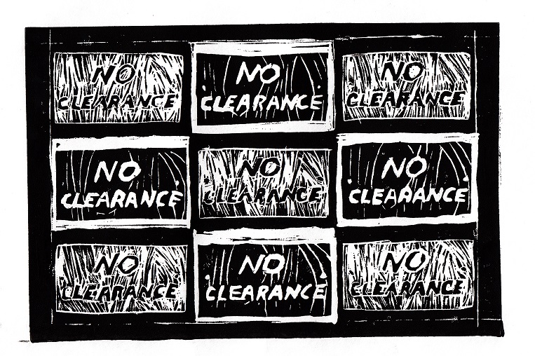
"No Clearance"
15.24x22.86cm
Dry Point
October 2016
15.24x22.86cm
Dry Point
October 2016
This piece was made to represent how limited people can feel, in a country that is supposed to be home of the free. When creating this piece I wanted to improve carving skills. I also wanted to practice creating controlled lines, since there is no going back once something has been carved out. I wanted to test myself by carving words, as well as creating texture, while incorporating "Campbell's Soup Cans" by Andy Warhol as my inspiration.
Historical Inspiration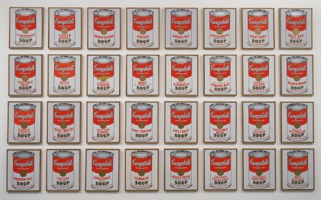
|
|
|
"Campbell's Soup Cans"
By: Andy Warhol "MoMA Learning." MoMA. MoMa Learning, 2016. Web. 28 Sept. 2016. |
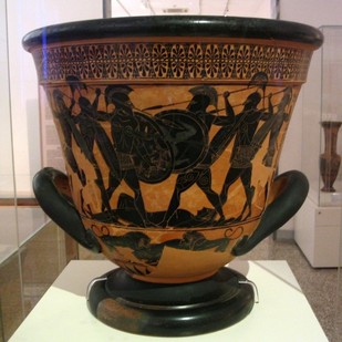
"A black-figure Calyx-Krater from Attica, c. 530 BCE"
ahencyclopedia. "Greek Pottery." Ancient History Encyclopedia. Ancient History Encyclopedia, 12 Jan. 2013. Web. 28 Sept. 2016. |
I considered using Greek pottery as an inspiration piece. Typically, this art movement would use clay to create these works of art which were made for everyday use. These were very practical, and fairly common in homes, used for everyday purposes. These pots used figures to represent an idea from a cultural belief, or other practices. They conveyed an idea or represented a figure. These pieces were made in 1000 to c. 400 BCE. I decided not to use "A black-figure Calyx-Krater from Attica, ca. 530 BCE" as my inspiration piece, because I enjoyed the concept that came with Warhol's work better. It didn’t help me explore the theme of journey as well as it needed to. For me, exploring has more to do with reaching new places and ideas, rather than expressing a traditional idea or belief.
My second idea was to replicate "Campbell's Soup Cans" by Andy Warhol. He created the soup cans to represent redundancy. He wanted to show the world that we are all about consumption, and consumerism. The cans repeat to show how it's a never ending cycle. People are always taking over time. There's no difference the soup cans other than the labels, but people are still buying and selling this product. Andy Warhol is one of the most popular and well-known pop artists. As a pop artists, he aimed to convey emotions through the use of modern cartoons and advertising. These artists wanted to erase what society had defined as high and low culture. By repeating the image of the soup cans, Warhol shows how everyone consumes something like soup, in high or low society.
I wanted to represent how everyone is controlled by something else. Whether that be the authority, parental figures, or even the media. It seems like nowadays people are always being told where they can and cannot go; or that they have to follow a certain code to fit in. The limitations of life are seen everywhere. So in my piece, i repeated the idea that admittance is only granted to very few, who are deemed “adequate enough.” I didn’t use different signs like how Warhol used different labels, but the same one. I knew that block printing would make it harder to create replica images. Before starting, I allowed myself leniency in freehanding the texture of the signs. I followed a general outline but they do differentiate.
Collecting Images & Tools
The tools used were linoleum carving tools, block printing ink, printing blocks, a brayer, a baren, and a tray.


Sketches


I looked through my photo gallery and decided that I wanted to create something industrial. I'd gone on an adventure taking photos in downtown Milwaukee, and felt very inspired. I decided on the "No Clearance" sign. I felt this sign could be interpreted in several ways, depending on what inspiration I used. I'd looked into the meanings and symbolism found in ancient pottery. I decided this was not a good fit for my theme (journey), so i continued to use Warhol. I knew that I wanted this piece to relate to the Pop Art movement. Pop Art fit with the theme so well, I put it in different variations in my sketches I'd considered using just one sign, but I didn't feel like it was enough. I needed something that would emphasize the point I was trying to make. I then found the Soup Cans as my inspiration piece. I ended up picking the second sketch, but the third one was based purely off the original. I was trying to figure out if the sign would look better up close, or far away. I didn't like these options so I picked the second one.
Experimentation


To begin creating my piece, I started to experiment with a block. I finalized and settled in on the idea of emulating Warhol. I went on to Photoshop, and took the original image, and made it a negative. i then arranged the original, and the negative side by side, making every square two by three inches. I aligned them all so that every other photo would be the opposite. Then I printed this sheet out, and used the graphite transfer method to trace my work. Next, I began to carve. I experimented with different tools and adjusting the size needed. I also began to get a feel for how I could best control every line made. I practiced creating texture, and experimented with line variety. After I felt comfortable with these tools, I stopped on my first printing block, and moved on to what would become my final printing block. After carving the final piece, it took many trials to get the print right. I had to go through many trials repeating and revising my steps, before I got to the final piece. I adjusted the amount of ink (adding more or less) and the pressure being applied during the transfer process.
Process


To begin the process of creating my final piece I took the skills learned in experimentation, and applied them. I went back onto Photoshop and took my original pictures, and reflected them. When printing, this would take the words and print them so they were not backwards. If I had continued with my experimental piece, the words would have been backwards, loosing the meaning of the piece. I took a new printing block, and did the graphite transfer method. I then began to carve again. I knew that whatever I carved away would remain white, and what stayed, would become black. For the original photo I carved the background but left the text to be black. For the negative, I did just the opposite. I then went into the texture of the background, and tried to recreate the wooden sign. I found big and basic lines, and applied them to the appropriate places. For the original, I carved out the background almost completely, but leaving room for detail lines. I used a small tool for this, as well as the lettering. I traced all the letters to ensure that they would be legible and present in every rectangle. After completing the carving, I had a demonstration on how to print. I took two large sheets of paper, and several of smaller sheets to put the image on to. Next I gathered a brayer, baren, ink, and a tray. I put ink onto the tray, and rolled it using the prayer. I then applied a thick coating of black ink onto the block. I then transferred this onto another clean, large piece of paper. Next I placed the smaller sheet of paper over this piece, and the back side of the other large paper on this. Lastly, I used my baren and evenly applied pressure over the piece. I removed the papers to reveal my final product.
Reflection & Evaluation
Overall, I am very pleased with the outcome of my piece. It looks very similar to the Photoshopped work I had used to plan, and each rectangle is fairly similar to the other. The main goal of this piece was to recreate every square to the best of my ability, looking as similar as possible. I tried very hard to make sure the words looked identical, and that the backgrounds had the same lines. This was a hard task to complete but I am slightly disappointed in the lettering. During the carving process, there were some spots I found myself loosing control of the tool in, and it shows.
The final product looks fairly decent and legible. The borders got slightly lost in the ink and printing process when I wish that they wouldn't have. They gave a sharper outline, which gave more of the sign appearance. The borders for all the signs were also difficult to make, because using no straight tools meant not being able to make straight lines. I did my best, but I could have used a ruler to make it better. I am still pleased with the outcome of the piece, since the errors were only minor, and did not take anything away from the piece.
I think that the conceptual qualities are fairly easy to understand. People understand that there are limitations to life, but I don't think that the message is completely conveyed upon first notice. People have to acknowledge that it's being repeated for a reason. But for anybody who knows Warhol and his work, they are more likely to understand what's happening in the piece. With this piece it uses the repetition of Warhol's cans, which is very easy to recognize. Finding the underlying meaning is harder.
Since it does not use the same well-known image, it may confuse the viewer. It's easy to read "No Clearance" which is fairly obvious what it means. It shows that people are not permitted into a certain place. One must wonder why it's repeated so many times, to realize that people are constantly told where they can't go. This relates to Warhol's theme because he wanted to show how people are always consuming and buying. It never stops, and this endless cycle is seen in my piece. I inverted the colors to mock how Warhol varies the year of his cans. Seeing this, the message is fairly clear. The journey is limited by what the law permits, but we challenge that. This relates to how pop artists challenged how people viewed the world, and what was defined as art. Like pop artists wanted to break the barriers set for people, just like how we challenge barriers set for us. It's seen throughout everyday life even through something as simple as a sign.
ACT Connection
1. My piece is effected by the inspiration "Campbell's Soup Cans" by Andy Warhol, because it uses the repetitive syle, and a normal sign, just like the original piece.
2. Andy Warhol wanted to created a way to tell society what it's problems were. He used the soup cans to represent how people are all about consumerism and capitalism.
3. While researching my inspiration, I concluded that the pop art movement was used to break down emotions, in a literal sense, while in a cartoon style. The culture around this time was largely based on what was deemed to be high, and low culture, and Warhol wanted to break down the culture barrier.
4. The theme around my research was redundancy, and people constantly being told what they can, and can not do.
5. The inferences I made while reading were that Warhol was anti-consumerist, and wanted to find a way to visually represent that. He used his knowledge in advertisement to represent his strong emotions.
Wilkins, David G., Bernard Schultz, and Katheryn M. Linduff. Art Past/Art Present. 5th ed. New York: Abrams, 1990. Print.
"Pop Art Movement, Artists and Major Works." The Art Story. N.p., 2016. Web. 02 Oct. 2016.
"Pop Art Movement, Artists and Major Works." The Art Story. N.p., 2016. Web. 02 Oct. 2016.
